Hopetalia
Quick healthcare Led the design and vision for a more human navigation to aid older adults.
Project steps
01 SUMMARY
Hopetalia was born from the recognition that many existing MedTech platforms present significant barriers to entry for older adults. These platforms often feature convoluted navigation hindering the ability of older adults to fully engage with their healthcare journey. Recognizing this critical need, Hopetalia was envisioned.
To create an intuitive experience for older adults, I began by developing and testing an alternative navigation system. This user-centered approach subsequently guided the design and development of the broader Hopetalia app.
BACKGROUND
Product owners, Engineering leads and Product manager.
02 ROLE
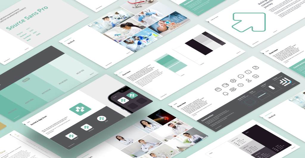
As Lead Product Designer, I initially collaborated with the Product Manager to research and conceptualize the idea for alternative navigation on Hopetalia app. Working with a design team of two, I established a robust design system and conducted extensive user research, including interviews and competitor analysis.
Following the MVP launch, I led in-depth usability testing, incorporating eye-gaze tracking and customer satisfaction analysis. Alongside, I worked closely with the development team to manage the implementation of the broader hopetalia app.
03 THE PLAN
PROBLEM STATEMENT
Complex navigation and a lack of accessibility features create significant barriers for older adults hindering their ability to effectively access and utilize healthcare apps.
WHAT IF
We could create a linear navigational approach, guiding users through essential tasks with clear, concise instructions and minimal cognitive load?
Project objectives
Conduct thorough user research with older adults to gain insights into their specific challenges and preferences when using healthcare apps.
Develop a MVP featuring a streamlined navigation approach, prioritizing clarity and ease of use for older adults.
Conduct rigorous usability testing with older adults to compare the effectiveness of the linear navigation approach to conventional navigation methods. Gather user feedback and re-iterate on the design based on user insights.
04 DISCOVERY
RESEARCH AND COMPETITORS ANALYSIS
Complexity: Current applications often present overwhelming information and complex navigation, leading to frustration and difficulty for users with varying cognitive abilities.
Cognitive Overload: Excessive features and complicated steps can overwhelm users with cognitive limitations, such as older adults and individuals with ADHD.
Motor Challenges: Complex interactions and lack of intuitive design elements create barriers for users with motor impairments.
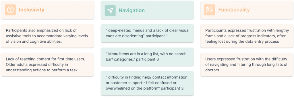
OLDER ADULT PATIENTS’ INTERVIEWS
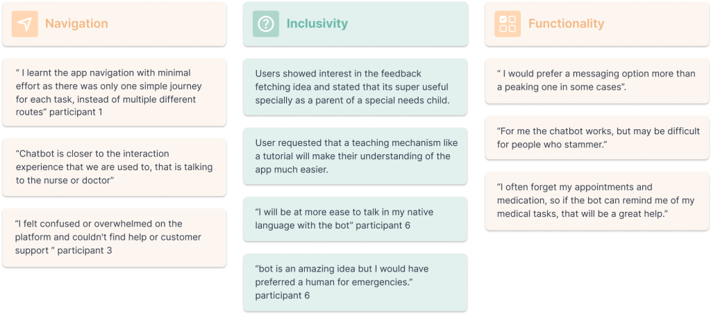
Six older adults were interviewed to gain insights into their experiences and challenges while using medical applications in their everyday lives.
Key areas of focus included: Functionality (like viewing reports, booking an appointment and messaging a doctor), Overall navigation and inclusivity features.
05 SOLUTION
MVP & USER JOURNEYING
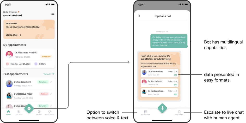
We utilised the painpoints and insights from the discovery interviews to develop an MVP. We spent a large portion of time building out the journeys of the app. Doing this work up front would minimise the effort in the long run when designing high fidelity mock ups.
06 TEST
PROTOTYPE TESTING
Eight older adults participated in usability testing using a Tobii eye tracker.
TASK 1
Book an appointment with DR Klaus for 22 Feb, 9.30
CONVENTIONAL NAVIGATION


CHATBOT NAVIGATION
TASK 2 |
Look for Doctor’s feedback regarding dosage change
CONVENTIONAL NAVIGATION


CHATBOT NAVIGATION
FEEDBACK
07 RESULTS
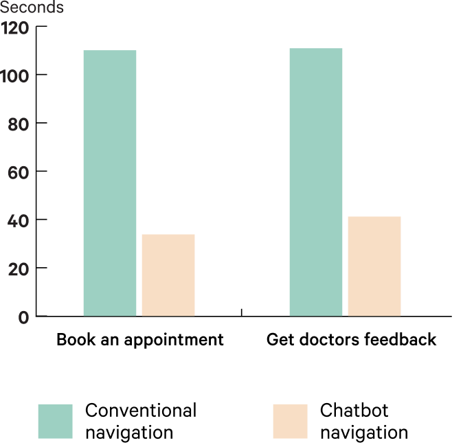
TIME COMPARISON
Usability testing revealed a 30% faster task completion rate with the proposed chatbot navigation for both tasks performed by the users.
EYE GAZE TESTING
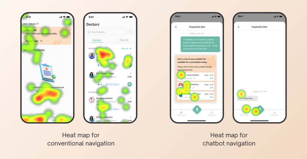
Tobii eye tracker was used to generate heat map for each participant and then averaged to identify common areas of visual attention.
Conventional navigation: Heatmaps revealed scattered user attention, suggesting difficulty in navigating and identifying key information. Users spent significantly longer completing tasks
Chatbot navigation: Heatmaps showed concentrated user focus on the Hopetalia Bot CTA, indicating efficient navigation and task completion.
TAKEAWAYS
The base solution was very popular and users showed ease of use. Although the solution solved the immediate problem. Customer’s would greatly benefit form:
Guide users through the platform with interactive tutorials, tool tips or guided tours to familiarize them with its features
Provide language options to cater to diverse user populations
Option to enlarge text for the whole app from the settings.
alternative communication methods beyond voice input, such as text chat, for users who may have difficulty speaking
08 NEXT STEPS
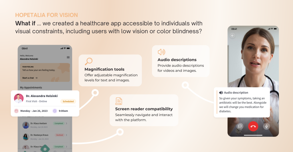
We’re exploring a new direction for this product vertical. This includes addressing existing issues, implementing minor enhancements, and developing concepts to revolutionize healthcare.
What if ..
Instead of a single, monolithic platform, Hopetalia would be a modular ecosystem with a core foundation and a range of specialized modules catering to specific user needs and capabilities.
